Showing posts with label interior design. Show all posts

22 May 2011

A few of my favorite things (right now)...

Wow.  13 days since I last blogged.  In that time frame I have had numerous photo shoots (mainly seniors hurrying to get their announcements out), my first wedding, the beginning of end-of-year school activities (I am room mom x 2), 2 birthdays, a visit from grandparents, illness and a travelling husband.  BUT things are slowing down.  I miss blogging.  Sigh.

To bring you up to speed I've got some pictures of a few goodies I've acquired recently - not only did I celebrate Mother's Day, but also my 36th birthday and a visit from my favorite shopping partner in crime, my mother-in-law.


My living room got 2 new color additions, that of a delicious rosette pillow from Target (top) and an almost forgotten corsage pillow I bought years ago at Cost Plus/World Market (below).  So glad I kept it around.


I've also stated a collection of architectural, chunky, pillar candle holders.   Hope to have a big jumble of them here one day.


One more new pillow from Target...


Check out this lovely that my brother/sister-in-law gave me for my birthday!  I love it so much.


I finally bought myself some converse.  I love them.  Even with all my Texas-sized jewelry.


And this is perhaps the creme de la creme of my recent finds.  Of course my lucky charm mother-in-law was with me... she usually is when I discover something BIG.  I have needed a desk - an actual desk - for my office ever since I redecorated it (HERE).  I had been sitting on a stool in front of an armoire banging my legs on drawers every, stinking, day, for months.  But I couldn't find anything I loved.  A short stop into Austin Consignment Shop and I stumbled upon this beauty... post 1950s (mid century modern) Steelcase desk.  I am in love with it.  It is in mint condition.  I don't think the guy realized what it was worth.  I came home and checked ebay for a ballpark figure.  There is an exact replica of this one currently going for over $900.  Guess how much I paid?  

$300.


Squueeeaaal!!!  All I need now is a hot pink office chair. ;)

30 March 2011

Fitting holiday decor into your home and your color scheme

You love holidays and like the festive look of holiday decor but how are you supposed to tie the pastels of Easter into a home with warm jewel tones?  Or for that matter, the reds and pinks of Valentine's Day?  Oranges and blacks of Halloween?  Also, how do you keep your decor sophisticated when so much of what is out there is cheap and more like party decorations than anything else?  Ok that last bit was a little snarky.  Lol.

For one thing, you certainly don't need to stick to any particular color scheme for any holiday.  That's one pretty obvious answer.  But that limits you quite a bit.  I usually run into this dilemma around this time of year.  My home definitely changes from time to time... my friends joke that it looks different every time they come over.  But that's not because I'm a shopaholic and am constantly buying new stuff.  I rotate things around (ok, so I do have a lot of things) but I make new things (on a budget) and I make simple changes to accomodate the seasons.  I'm going to share a few of those tips with you for Spring and/or Easter decor.  Because my home is not conducive to pretty much any color scheme you see this time of year.  My home has a lot of warm and jewel tones and bright popping colors.  So to add in white feels blah to me, and to display pastel things feels wasteful, because I don't really like pastel colors all that much, plus they are too "cool" against my warm colors!

My tip for tying in different color palettes is to start with determining your most common color or color group in your home, and in the new color scheme you want to introduce.  For me, at this time of year, that would be blues/yellows/greens.  They crossover into the pastel palette, but don't clash with what I have going on in the rest of my home, even though they are in much brighter shades.  As much as I love a little pink, and as popular as it is this time of year, it just doesn't work in my house (except of course in my daughter's room!) - so I stay away from it.

Here are some examples of how that fits into my home... all these pictures are taken in and around my kitchen because that is where I tend to focus the majority of my holiday decorating.  It also happens to be one of the "brightest" spots in my home, as far as color goes.  You'll notice that I round things out with a lot of neutrals.  Can never go wrong with neutrals!

Here's a big picture of my kitchen.  I have a lot of oranges/citrusy colors in there.  I cleared off my counters (which also housed a lot of red and turquoise to compliment and give dimension to the citrusy colors on top of my cabinets), and focused all my lighter Spring decor down on that level, separating it from the citrusy pallette up high.  So, separating color schemes as much as you can is one way of tying several color schemes together.


18 February 2011

Kitchen Redone

The second room to get a facelift after our flood was the kitchen.  The kitchen/living transition area was the catch-all for much of the water from our attic.  So it had the most work done - sheet rock, paint, ceiling, etc.   I saw another opportunity for a fresh coat of paint!  And I had an hour to decide what color.  Freaked me out a little, but when it comes to paint some people (me) stew over it to the point that it never gets done.  So in a way it was good.  I went with my gut instinct and came home with 2 colors.  It was nice not having hundreds of paint samples to fret over!  In the end I chose the bolder of the 2 (does anyone else feel like they always go safe and regret it later?).  Well, "Guillermo the painter" may have been the one to finally convince me.  But I LOVE IT.   And I think everyone should have a Guillermo!

Here are the pictures of the new color AND my new table and chairs!!!


The table was $147 on closeout at IKEA.

Get out, right?

I had to have it... I'd always pictured a more modern table in my house.  Plus I needed something to counteract the dark wood cabinetry... and my house was beginning to feel too - wooden.  Does that make sense?  I love woodwork but moderation in all things, know what I'm sayin'?


Here's the black IKEA frame transformation.  Spray painted the frame glossy white, and spray painted the glass with chalkboard paint.  Easy and much improved.


Now all I want to do is stare at my kitchen.  

Is that weird?

PS - How do you like the new blog look?  I think I'm gonna stick with this one for a while. ;)

Linking up:

Join us Saturdays at tatertotsandjello.com for the weekend wrap 
 up party!

13 February 2011

Love is in the air!

Hi all!  So here are some pictures and commentary from the gorgeous hotel we stayed in this weekend!  I don't what it is about fancy hotels, but I can't think of anything more luxurious than getting to stay in a posh place for just a night or 2. 

The first thing I usually do is lie down on the bed.  That always tells me something.  If you just melt into it, you know you've picked someplace truly indulgent.  The Driskill's bed was fabulous!  I felt like I was sleeping on feathers.  And the way it was made up was so fun, too.  I am not an animal fur lover - fake or real - but there was a rather gorgeous fur throw on the bed which came in very handy as we've had some really, really cold weather here in Austin lately!  You will probably never find one in my home, but I sure loved snuggling under it with the Mr.

I always find inspiration in how hotel rooms are decorated. My husband thinks I'm weird - but I always take tons of pictures of the places we stay!  Well, unless it's a Motel 6.  Lol.  But with my fascination with fancy schmancy hotels I'm thinking maybe I need to open my own one day!  Or at least get hired to decorate one.  Now that would be fabulous fun.

Here is a collage of the items that struck my fancy!  Enjoy!


Top left: love this monogram pillow.  It's like an oversized lumbar-support pillow.  Made from white linen.  Front, back and sides all pieced together separately (so it's shirt box-shaped) and not turned in after sewing together... so the edges are left raw and lovely!

Top right: I've got this orange in my living room right now.  But living in Austin, anything of the pumpkin orange category has been deemed "UT (Univ. of TX) orange".  And when you put it that way, I don't love the color so much.  I guess I've had one too many people walk into my house and say - "Oh, are you guys UT fans?"  Serisouly?  So yeah, I was going to change it... but I love it paired with this gorgeous taupe-y brown trim and I may reconsider keeping it on my wall and adding some kind of detail to break it up a bit. I found this at Hobby Lobby, and I'm excited to try it out!

Middle left:  Oh how I love me a window seat.  Never had one.  That's gotta change.  And it will definitely need some very large down pillows on it, just like these.

Middle right: I love old antique-y looking faucets!  The ones labelled "cold" and "hot"?  So cute.

Bottom left: Drooling over the tiling in the bathroom!  I've always loved black and white on a bathroom floor.  Our bathroom also had subway tiles on the walls.

Bottom right: Hoepfully you can make out the awesome oversized, framed postcard.  How darling would that be for Vanlentine's Day?  I am going to try and whip one up!!!

Happy Valentine's to all tomorrow!!!  If you need something fun to send out really quickly to co-workers, office crushes, hubbies or girlfriends, check these ecards out by Kate Spade's "Behind the Curtain" project... love it!!!

09 February 2011

Making Milagros

I have always been drawn to contemporary milagros, the kind used in decor.  I am a lover of mixed media too - paper, fabric, metal, wood, paint, ink, etc.   That whole folky genre of art makes me smile! 

Last year was my first attempt at making a milagro. 

[DSC_0003.jpg]

But this was before I understood it's roots.  Now you are probably wondering as well - what is a milagro, what is it's origin?  Milagro means "miracle" and once upon a time milagros represented wishes.  In catholicism people would wear milagros to present their needs or the needs of those they loved to the saints.  If it was a healing wish, perhaps for a hurt arm, they might wear a silver arm charm on a necklace.

Today the creation of milagros has morphed into the use of mixed media, among other things.  Below are some fabulous examples.

By Teresa McFayden:
Faithmilagros

And by Heather Bullard:

Artbliss8

Here are some other goodies I have made or picked up that remind me of milagros.

A mosaic I made last year:

[DSC_0005.jpg]

This fun accent I bought for my office/design room from Hobby Lobby:


I am so excited because I've got some friends coming over tomorrow night for a milagros party. I suppose that it is because of the popular symbol of the heart that I see in many of these gorgeous renditions that I associate milagros with Valentine's Day. Plus, Valentine was a saint. So it is fitting in my mind to include milagro making into my V-Day festivities.:)

We'll also be decorating sugar cookies and writing love notes (ooh la la) to our hubbies.  I'll be sure to take lots of pictures and share with you after the weekend!

PS - Please vote for my His and Her Valentine's swag in THIS contest!  And don't forget to eneter the $45 gift certificate giveaway to CSN stores!

04 February 2011

Playroom Redone

Visit thecsiproject.com

So here is my first update following the flood.  Our upstairs areas got the worst of it, because the water heater that leaked was in our attic (we have 2, the other one is in the garage, and that one leaked last summer).  After replacing the ceiling and sheetrock they of course needed to repaint as well, so we decided to give the room a facelift with a new color.  

Here is a before pic from when we moved in a couple years ago,


and here it is now.  


Isn't the blue refreshing?  I. LOVE. IT.  I can't believe I left it colorless for so long.  Such is life.

 Since I also had to refinish or replace several of the letters from my alphabet border, and I'm pretty sure I never posted it on this blog to begin with, I am entering this post into the CSI Project this week. :)

Also linking up here:

Join  us Saturdays at tatertotsandjello.com for the weekend wrap 
 up           party!

27 January 2011

Fit for a princess...

Well, I'm back.  My house is coming back together.  Finally.  We made some new paint choices and even rearranged the furniture, to make the most of a terrible situation!  It helped. :)  I'll show off some of the new look soon!

For today though, I'm sharing a fun project for that little girl of yours.  I've wanted some sort of plaque above Sasha's bed for some time now.  And like most 4 year olds she is very much into princesses right now.  I love the architectural crowns I see everywhere - like in Ballard Designs.  Hobby Lobby is my go to place for those kinds of knock-offs, and my trip there to find inspiration for this project did not diasppoint! {But the again, does Hobby Lobby EVER disappoint?}

So I found a red metallic tray in the clearance section, that had the lovliest shape.  And I found a crown in the religious aisle(?)...   Together they gave me exactly what I was looking for.


I don't have a before picture of the tray, but I spray painted it ballet slipper pink (Krylon!).  And I spray painted the crown glossy white... little tip here, I've learned {the hard way, I'm afraid} that when it comes to white, always, always go with glossy.  Flat and sometimes satin are just bad, bad... as in they look bad.  More of a gray white and chalky.  Blech.


I glued the crown to the tray - gorilla glue works, even hot glue maybe?  And voila!  A beautiful plaque, fit for a princess.


Now I just need some ideas as to HOW to hang it... probably above the bed in place of her "4".  Do they make plate hangers that big??? Or should I try something else?  Ideas please!!!

08 January 2011

Crafting with the Stars - As for me and my house project!


I posted a picture of this project early in December and promised a tutorial.  After Christmas passed, I thought it would be pointless to go back to it.  But Crafting with the Stars Round 2 has begun, so I'm submitting this project there. :)

I was inspired to do this project by something I saw in Hobby Lobby.  I really had to think this one through, especially to "make it mine".  How was I going to apply the lettering?  Directly on the fabric would have been difficult - since there are so many words the lettering has to be small, and I thought that writing or painting or whatever on the fabric might not be legible (although the original HL version I believe had paint stamped letters... and I just couldn't imagine either making that many tiny stamps, or the cost of buying them!)  Then it occured to me that I could write around the edge of the frame with a paint pen.  Vinyl was also an option, but fonting is a hobby of mine and I don't own a Silhouette, so I just don't use vinyl much.   I just about went that route (with writing on the frame itself) when the idea came to me that I could just write on the glass.  Problem solved. 

Next issue, would the key fit under the glass?  Well I just happened to find a deep set frame that was perfect.  Each of these frames (found at Hobby Lobby) is sold with 2 pieces of glass!  Yah!  So by taking one out I had a little room for the raised key.  AND I had an extra piece of glass should I make a mistake with my lettering. 

The key fits very nicely.  I have the perfect canvas for my lettering.  And all is right with the world.  Well, my world anyway. :)


Materials:

deep set frame (love the 50% off sales at Hobby Lobby!)
fine tip paint pen
keys (I found a ring of 4 of them at Hobby Lobby, at 50% off of course!)
fabric
hot glue

Instructions:

Mount your fabric to a solid backing.  These frames came with a styrofoam insert, so I used that.  The drawback - hot glue melts through styroam very quickly.  So I would recommend using another product like Gorilla Glue if you go looking for these particular frames.  I just tend to try hot glue with everything first because it's so cheap.  If you use another kind of frame, cardboard would work great for your backing.  I routinely save boxes to hack up for this kind of thing. You can a) mod podge your fabric tot he cardboard or b) stretch around the edges and hot glue to the back of your cardboard.  I did "b" with my styrofoam and as long as I applied the hot glue to the fabric and waited a few seconds before pressing to the styrofoam, it didn't melt it away. **Make sure as you are mounting your fabric, that if you use a print such as checkers or stripes, that you mount it so those rows lay straight and not slanted.

Mount your key where you want it in onto your fabric covered backing with a thin line hot glue (so it's not visible).


Place the glass over your key/backing to determine placement for writing.  Mark some margins with a dry erase marker.  Write or trace your lettering onto the glass.  I love to freehand but this project needs precision, so I traced.  I used the "zapfino" font on my Mac.  Print out your phrase of choice ("A house of order" also works for this project and would work well for a smaller frame.  My frames are 5x7 in.)  Lay the printed wording underneath your glass (make sure it's centered and straight first!) and trace with your paint pen.  Once dry, lightly rub off your dry eraser marked margin markings

Insert backing and glass into frame and voila!  You're done.


Really not a complicated project at all, it just took some figuring out!

Linking up!


20 December 2010

Bells are ringin', children singin'...

...all is merry and bright!


Easy Christmas decor... painted chip board letters in back, and these fun stand up letters from Hobby Lobby in front!  The back letters are just tall enough to peek out over the top of the front letters.  Makes me smile every time I look at them!

handmade projects

10 December 2010

peace sign pillow


soft, lush pillow from Target for $8 + heat and bond + red felt = my new favorite holiday decoration

Join us Saturdays at tatertotsandjello.com for the weekend wrap up party!

UndertheTableandDreaming 
handmade projects

08 December 2010

Christmas decor


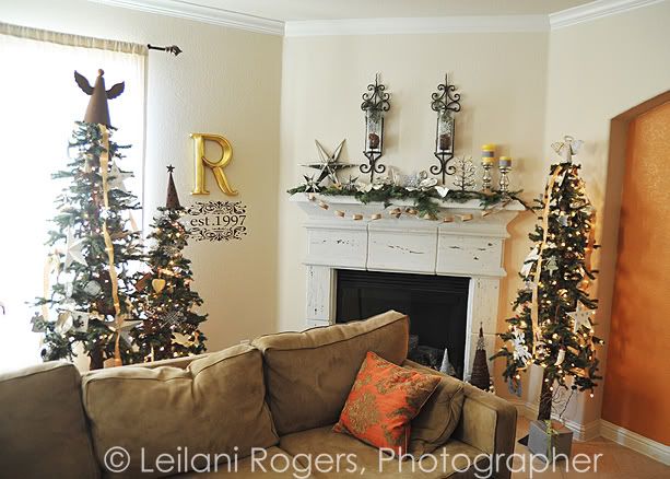
Only in blogland does December 7th feel too late to post a picture of your Christmas mantle.  Oh well.  I always did march to the beat of my own drum.  Are there any mantle parties still going on?

I played around with this for a couple hours.  Yup.  I usually keep candles in my sconces but I wanted to give it more height, so I stuck in a fresh branch, grapevine ball and silver snowflake ornament instead.

You've all noticed the mercury glass trend, I'm sure.  Loving that!  So I pulled together what I had... some little bird figurines, a gumdrop tree, a couple candle holders, silver magnolia leaves (did you know you can spray paint leaves???), and stars.   To top things off I tucked in several fresh tree trimmings, a paper chain made with kraft paper and scrapbook paper, and my Ballard Design knock off ornaments from last year.  The stars presented a bit of a challenge, but I think it works.  I really didn't have any other place for them in the house and I really REALLY love them.


I really love how this whole area turned out, actually.  I usually hang every ornament I've ever gotten.  Kind of a sentimental gesture.  Plus I really do love all my ornaments.  But this year I really wanted to do more of a theme.  And I love white (you wouldn't think it looking at my house, there is color EVRYWHERE!).  Since I have 4 messy kids, I just use it where I can for now.  So I went through the ornaments and used only white and neutral colors this year, and I kind of ran with the star theme.  Some of those big stars are usually used in my outdoor decor, but I love the bold statement they make on my trees.

I also added long trailing ribbons.  I've seen Martha Stewart do this and ribbon is huge at Pottery Barn this year.  Love how it looks... 2 of the trees have a goldish ribbon coming straight down the sides, and one has a brown with white polka dots wound around in a spiral.

It all blends in so much more nicely with the rest of my decor this year.  Plus I'ms till on an organic high from Thanksgiving.  Although I have reds and greens already in this room, I didn't want my trees to look gaudy.  I wanted elegant and natural at the same time.  And unlike years past, I didn't have to undecorate any other parts of the room to keep things from looking too cluttered with the addition of 3 Christmas trees.

What's your style going to be this year?

16 November 2010

Autumn Garland


I've been stringing a lot of things this month!  I love garlands and banners for the holidays...

This garland was made using a pack of vase fillers from Target, as well as some fun pumpkins I bought in my grocery store's floral department, and cinnamon sticks.

I used thin, thin twine to string everything.  Looks like this:


Tied a fun pleated ribbon onto each end...


Didn't take me long at all!  So go whip one up for yourself!


Linking up:


BWS tips button

PS - I've got another giveaway coming up!  Stay tuned!!!
 

PPS - My friend Kierste from Brown Paper Packages is having a giveaway for a $50 gift certificate from the Vintage Pearl!  Go enter!!!