
You love holidays and like the festive look of holiday decor but how are you supposed to tie the pastels of Easter into a home with warm jewel tones? Or for that matter, the reds and pinks of Valentine's Day? Oranges and blacks of Halloween? Also, how do you keep your decor sophisticated when so much of what is out there is cheap and more like party decorations than anything else? Ok that last bit was a little snarky. Lol.
For one thing, you certainly don't need to stick to any particular color scheme for any holiday. That's one pretty obvious answer. But that limits you quite a bit. I usually run into this dilemma around this time of year. My home definitely changes from time to time... my friends joke that it looks different every time they come over. But that's not because I'm a shopaholic and am constantly buying new stuff. I rotate things around (ok, so I do have a lot of things) but I make new things (on a budget) and I make simple changes to accomodate the seasons. I'm going to share a few of those tips with you for Spring and/or Easter decor. Because my home is not conducive to pretty much any color scheme you see this time of year. My home has a lot of warm and jewel tones and bright popping colors. So to add in white feels blah to me, and to display pastel things feels wasteful, because I don't really like pastel colors all that much, plus they are too "cool" against my warm colors!
My tip for tying in different color palettes is to start with determining your most common color or color group in your home, and in the new color scheme you want to introduce. For me, at this time of year, that would be blues/yellows/greens. They crossover into the pastel palette, but don't clash with what I have going on in the rest of my home, even though they are in much brighter shades. As much as I love a little pink, and as popular as it is this time of year, it just doesn't work in my house (except of course in my daughter's room!) - so I stay away from it.
Here are some examples of how that fits into my home... all these pictures are taken in and around my kitchen because that is where I tend to focus the majority of my holiday decorating. It also happens to be one of the "brightest" spots in my home, as far as color goes. You'll notice that I round things out with a lot of neutrals. Can never go wrong with neutrals!
Here's a big picture of my kitchen. I have a lot of oranges/citrusy colors in there. I cleared off my counters (which also housed a lot of red and turquoise to compliment and give dimension to the citrusy colors on top of my cabinets), and focused all my lighter Spring decor down on that level, separating it from the citrusy pallette up high. So, separating color schemes as much as you can is one way of tying several color schemes together.


Here's some close-ups of those Springy details:

I found the cute "Easter" sign at Hobby Lobby, you guessed it, ON SALE. (Love that place!) It had kind if a tacky wire flower garland thing wrapped around it that had to come off, like, right away.
I bought the grass at a local health food store and planted it in that silver tray that I have had and used for forever... used to buy that stuff every year and haven't in a while. I remembered to do it this year though, and it is so perfect for Easter!
And then there are 2 of my cute little springy votives (tutorial found HERE), which may or may not be getting featured at Mod Podge Rocks in a few weeks here. (Yay!)
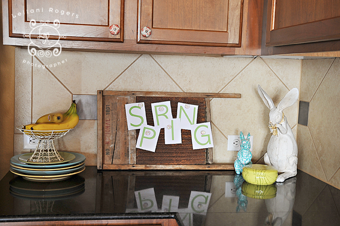
Over here we've got a stack of plates under my bananas (using your dishes in your kitchen decor is an easy addition and helps free up some storage space in your cabinets).
That DARLING turquoise bunny there can be found at Target right now. So cute.
And my wash board turned magnet board is a constant in my kitchen. I can tack up different things all year long depending on the season... love that!

On the other end of my counters I used this basket (which is normally in my pantry holding potatoes) for some faux easter eggs. I slipped a couple lavendar ones in there with the blues/yellows/greens and it still blends in pretty ok with everything else because I've got some purple in other nearby parts of the house (see pic below).
The darling rabbit picture was printed off from The Graphics Fairy and mounted on scrapbook paper.
Here is the centerpiece of my table:
 |
| I used a vase, filled it with some natural grass (basket filler purchased at Cost Plus/World Market, also seen in the potato basket above), and slipped in a few more faux eggs and a cute little door hanger I bought years ago from Hobby Lobby. On top of my burlap runner it doesn't stick out too much against the red/orange curtain pattern. Here is a close-up of the vase: |

Those cute little egg cup sprinkled along each side of the vase? Purchased from the $1 aisle at Target a couple years ago. Pink came in the set as well, but they're still in the box. ;)
I am using them as votives. See the tealight in there?

Here's how the table setting fits into the rest of the kitchen:

The mostly neutral colors work really well to tie it all together, don't you think?

Hope there's some tidbit in here that is helpful. I know I avoided a lot of holiday decor for a while because I just couldn't figure out how to incorporate it without it clashing with the rest of my house!
2 comments:
These are great tips--thanks!
You have some wonderful ideas here, Lei. Your home looks warm and inviting.
Post a Comment